The influence of colour is not something to overlook
Published
We are emotionally driven. Market psychologists stress repeatedly that customers buy on the emotion of the moment. Of all the senses, sight moves emotion fastest, and the most universally effective influence on sight is colour. By one figure, 85% of people buy a product partly because of colour, including the colour of its packaging and its logo. Most people tend to read blue and green as environmentally friendly and red as not, and much of the time blue reads as greener than green itself.
Most companies have their own colours, of course, and those shape corporate image and brand effect. So think about what kind of person your reader is and what emotion tends to govern them, then pay attention to the colours your email uses — they will affect how readers respond to the content. For using images in email design, see How to use images in email — essential reading for eDM designers.
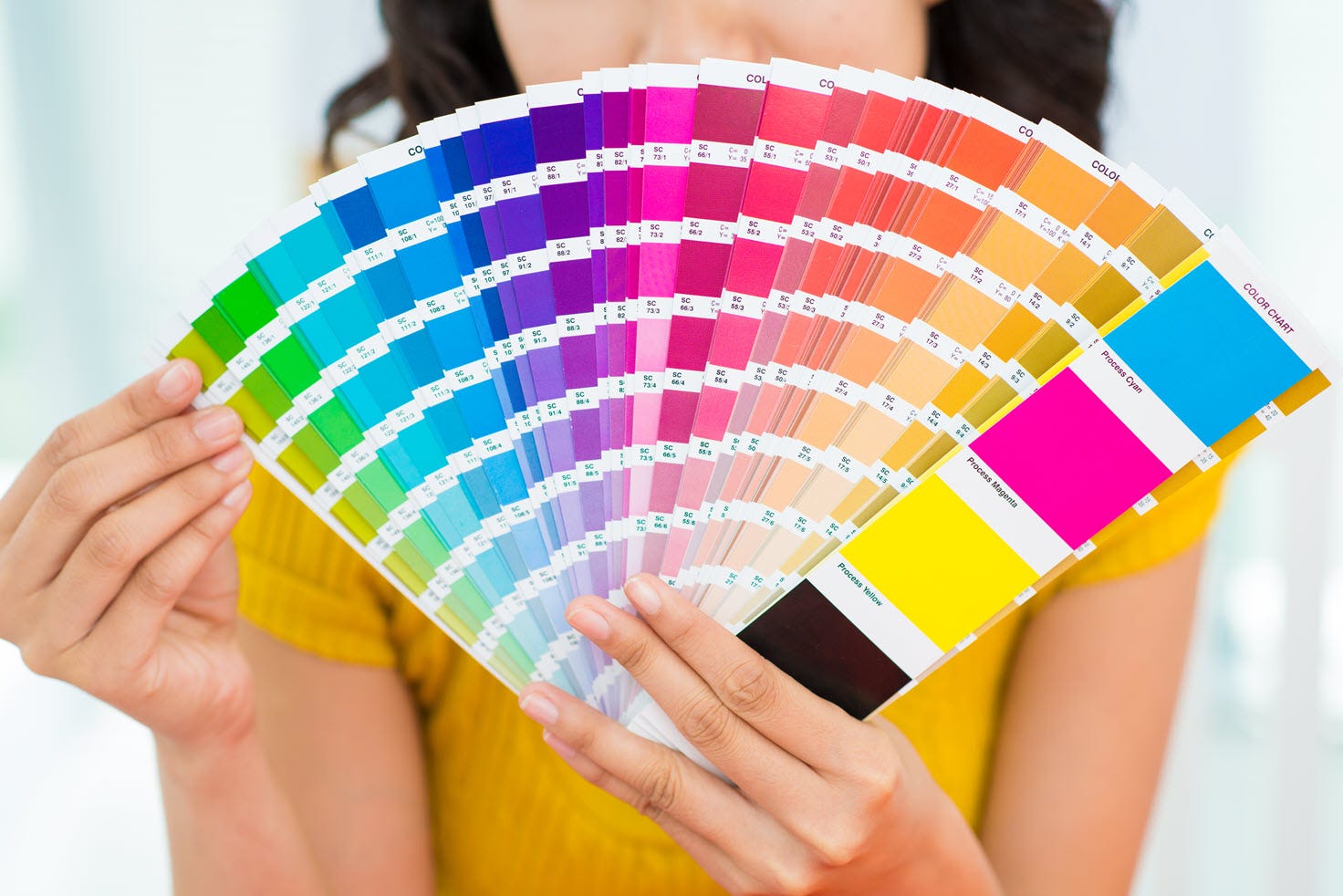
Some reference points:
-
Men are found to prefer blue, green and black; women prefer blue, purple and green. Blue, then, is the colour most people like — possibly because of its association with sky and ocean, and with the values of human civilisation: peace, trust, loyalty and order.
-
Orange, yellow and brown are chosen less often. People perceive them as cheap.
-
Women tend to prefer tints, men tend to prefer shades.
More recent research adds:
-
Colour preference is tied to life experience — a favourite colour may trace back to a favourite football or basketball team.
-
Pale blue and pink appeal to adolescents of both sexes, who are in a period of gender ambiguity and so gravitate toward these softer, less definite shades.
-
Colour preference also relates to the language a people speaks, because a given colour may have no suitable word in a given language family.
Understanding these principles helps your email do more than attract readers — it makes the email feel approachable, and moves readers toward the response you are hoping for. For more on calls to action, see They are waiting for a chance to respond.