Build up your list with high-converting signup form - Maximize conversion by optimizing signup form
79% of marketers grow their lists using signup form. You may not know how the design of signup form can affect the number of subscribers. Apart from rewarding, simple and concise design boosts subscription or registration effectively. Here are 5 skills which help you to build up a high-converting signup form.
- Keep it Simple
- Do not ask for too much information.
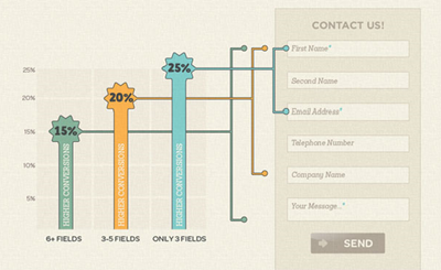
- Only ask for the necessary information, for example, email address and name. A complex signup form with a bunch of question will stop users from signing up.

Maximize conversion by reducing fields.
(From Socially stacked)
- Provide incentives to users
- Reward users with valuable returns.
- Try to imagine that why users should subscribe your newsletter. No one would sign up if no returns provided. Users will still quit if they do not find any values from your newsletters. On the other hand, you may send useful sales information to users regularly.
- Identify the values clearly
- Specify the values of signing up using simple bulleted list.
- 66% email marketers will state what users can get from newsletter: tell users what they will get after signing up. Add value and relevance to the header as well as the button. Rather than simply asking users to sign up, show the values to users. To gain customer loyalty via personalization, you can provide users with few options of eDM content and let them choose what they would like to get from you. You will captivate your subscribers by sending the most relevant eDM to them.
- You are also recommended to set an expectation of frequency in the opt-in form. Better solution would be allowing users to choose the frequency they would like to hear from you. Readers will not get crazy with your frequent emails then.
For the button copy, do not only use “submit”, “buy it”, “order now”, etc. Let your button convey value as well. For example, “get my free trial now”, it explains clearly what the users will get after signing up.
- Provide social proof
- Social proof can persuade users to signup.
- A counter, which shows the number of subscribers, next to the signup form helps to convince users to subscribe or signup.
- Privacy protection message
- Promise you will protect users’ privacy.
- Leave a promise stating you will protect subscribers’ privacy. Yet, do not use any negative wordings like SPAM in the privacy statement. For example, “we will not send SPAM email to you.” Negative wordings will reduce the signup rate. Instead, you may use “we will protect your privacy.”
Golden rule: Provide users with strong reasons for signing up
The most important rule which boosts sign up rate is to show users the value of signing up. Do give and take rather than only take. Let’s share the result with us after creating signup form with these 5 tips.
Source:
Aug 2020 (6)
Dec 2016 (4)
Nov 2016 (2)
Oct 2016 (1)
Sep 2016 (2)
Aug 2016 (7)
Jul 2016 (1)
Jun 2016 (6)
May 2016 (4)
Apr 2016 (2)
Feb 2016 (1)
Jan 2016 (2)
Mar 2015 (2)
Feb 2015 (2)
Dec 2014 (2)
Nov 2014 (2)
Oct 2014 (6)
Sep 2014 (6)
Aug 2014 (8)
Jul 2014 (8)
Jun 2014 (10)
May 2014 (8)
Apr 2014 (10)
Mar 2014 (10)
Feb 2014 (8)
Jan 2014 (10)
