8 tips of igniting your readers’ interest with call-to-action
What is a Call-to-action [CTA]?

CTA is a clickable button urging readers to take specific actions, for example, viewing more details, visiting external website or purchasing products, etc. It is essential for engaging your readers and converting them into leads in an email campaign. Here are 8 tips of creating a high-converting CTA.
1. Location
Locating CTA above the fold, i.e. at top & centre column of the email, can grab readers’ attention within a glance. Do not hide the CTA or expect readers to scroll down to find the CTA by reading the whole email. You may repeat your CTA at the bottom of the email to urge users to take action. Also, leave some space around the CTA helps to visualize the CTA.
2. Contrasting Color
Using contrasting colors relative to email background can always stick out the CTA.
3. Make it BIG
To grab readers’ attention in a glimpse, a huge and clear CTA is necessary. But, make sure the size fits the email design.
4. Make it clickable
Make the CTA clickable and look like a button by adding some effects like button bevels, shadows, hover effects.
5. Image based CTA with text
Write few words of explanation next to an image based CTA. Remember that image in email will not be displayed if your subscribers do not download image. In order to entice your readers to download the image, you may add a short explanation stating what the benefits of clicking CTA are. The best practice would be placing a text based CTA above the image based CTA as this allows users to click CTA without downloading any pictures. Text based CTA raises click rate sometimes.
A more convenient and advanced solution will be using bulletproof button. CTA will be shown with image if email clients do not block the images. However, with bulletproof button, users can read the CTA no matter the images are blocked or not. The bulletproof button enables users to read the CTA in a colored box if the images are disabled.To create a bulletproof button, HTML, VML code and inline CSS skills are required to include background image and color in the tag. You may try this to create a bulletproof button.
6. Secondary CTA
Too many CTAs can cause less conversion as your readers will not spend more than 1 minute in choosing a CTA. Focusing on just one CTA adds more significance to it and grabs users attention as subscribers may just spend a glimpse on your email. But, a secondary CTA is recommended to boost conversions. If the primary CTA fails to attract your readers, providing an alternative CTA with more information of the product or service helps to convince your readers to take the primary CTA.
The secondary CTA can be located next to the primary CTA so that your subscribers can identify 2 distinctive routes easily.
7. Create sense of Urgency
Use few simple action words to create sense of urgency. For example, “call now”, “subscribe now” or “3 days left for 30%off”. Discounts can be offered to early birds who click the CTA first.
8. Use of valuable & relevant wordings
CTA which conveys value can largely boost conversion. Rather than only asking your readers to take action, tell them what benefits they can take by clicking CTA. But, make sure to give users what they expect from the CTA
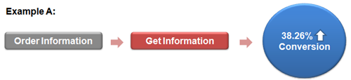
And, use wordings relevant to users.
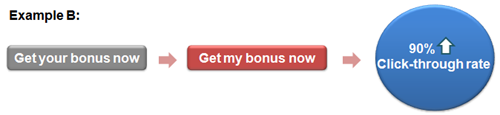
Including an arrow (>) next to the text inside the CTA can enhance conversion and click rate as well.
CTA is the key to high conversion rate. Tell us if you can think of more skills on designing CTA.
Source:
Campaign Monitor
Jonathan Miller
Michael AAgaard
Aug 2020 (6)
Dec 2016 (4)
Nov 2016 (2)
Oct 2016 (1)
Sep 2016 (2)
Aug 2016 (7)
Jul 2016 (1)
Jun 2016 (6)
May 2016 (4)
Apr 2016 (2)
Feb 2016 (1)
Jan 2016 (2)
Mar 2015 (2)
Feb 2015 (2)
Dec 2014 (2)
Nov 2014 (2)
Oct 2014 (6)
Sep 2014 (6)
Aug 2014 (8)
Jul 2014 (8)
Jun 2014 (10)
May 2014 (8)
Apr 2014 (10)
Mar 2014 (10)
Feb 2014 (8)
Jan 2014 (10)